Island Insight
Youth-health engagement analysis for RBC Borealis' Let's Solve It 2026 (Team Island Insight x KHLF).
README
Upopolis Analytics Dashboard
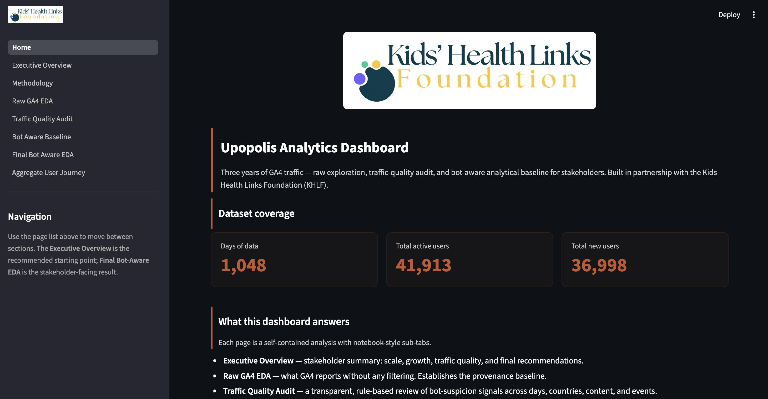
This repository analyzes Google Analytics 4 data for Upopolis, a Kids Health Links Foundation platform. The project turns a stacked GA4 export into a Streamlit dashboard, reproducible notebooks, and generated analysis artifacts for stakeholder reporting.
The current project state is:
- raw GA4 EDA is complete
- traffic-quality / bot-suspicion audit is complete
- bot-aware engagement baseline is complete
- final bot-aware EDA dashboard is complete
- aggregate user journey UMAP analysis is complete
The work is intentionally careful about what the available data can and cannot prove. The current GA4 file is aggregate data, not session-level or user-level tracking. That means the dashboard can support population-level engagement, traffic quality, content discovery, and ideal journey analysis. It should not be presented as individual youth disengagement prediction.
Project Goal
The proposal asks for a Youth Engagement Analysis Tool that helps Upopolis and KHLF understand engagement trends, retention signals, program effectiveness, and funder-ready outcomes.
This repository currently delivers the foundation for that tool:
- a stakeholder-friendly dashboard
- bot-aware engagement metrics
- transparent data-quality warnings
- aggregate content journey mapping
- plain-English methodology and limitations
Because BigQuery/session-level data is not currently available, the project uses an aggregate journey approach instead of claiming to observe exact user paths.
Data
Main input:
data/full_data.csv
Current snapshot:
June 1, 2023 to April 13, 2026
1,048 days of GA4 history
16 parsed GA4 report sections
The export is a stack of smaller GA4 reports, including daily active users, new users, engagement time, traffic channels, countries, retention cohorts, page views, and event counts. The shared parser lives in:
upopolis/io.py
Dashboard
Run the dashboard from the repo root:
PYTHONPATH=. streamlit run streamlit_app.py
Dashboard pages:
| Page | Purpose |
|---|---|
| Home | Entry page and dataset summary |
| Executive Overview | Stakeholder summary of the main findings |
| Methodology | Definitions, thresholds, assumptions, and limitations |
| Raw GA4 EDA | Original unfiltered GA4 exploration |
| Traffic Quality Audit | Bot-suspicion and traffic-quality review |
| Bot Aware Baseline | Raw vs bot-aware vs conservative KPI comparison |
| Final Bot Aware EDA | Stakeholder-facing bot-aware EDA |
| Aggregate User Journey | UMAP-based aggregate content journey map |
The stakeholder-facing result is the Final Bot Aware EDA plus the Aggregate User Journey page.
Notebook Workflow
Run the notebooks in this order:
1. notebooks/upoplis_intial_eda.ipynb
2. notebooks/bot_traffic_quality_audit.ipynb
3. notebooks/bot_aware_engagement_baseline.ipynb
4. notebooks/upopolis_final_bot_aware_eda.ipynb
5. notebooks/aggregate_user_journey_umap.ipynb
1. Raw GA4 EDA
File:
notebooks/upoplis_intial_eda.ipynb
Purpose:
Establishes the original GA4 baseline: daily users, new users, monthly trends, weekday patterns, acquisition channels, countries, page views, events, and raw retention cohorts.
Key raw numbers:
Active user-days:          41,913
Average daily active users: 39.99
Peak DAU:                    352 on February 11, 2026
Total new users:          36,998
Returning activity share:  11.8%
The raw EDA is useful, but it is not the final interpretation because several patterns suggest traffic-quality risk.
2. Traffic Quality Audit
File:
notebooks/bot_traffic_quality_audit.ipynb
Output folder:
analysis/bot_traffic_quality_audit/
Purpose:
Flags days and patterns that look bot-suspicious or low quality. This is not a confirmed bot detector. It is a transparent warning system based on aggregate GA4 signals.
Current audit summary:
Total days analyzed:       1,048
Tracking warm-up days:        90
Bot-suspicious days:         278
Uncertain days:              178
ARIMA anomaly days:           43
Review-country share:       40.5%
Suspicious page-title share:  6.2%
Passive/basic event share:   99.8%
The first nonzero traffic day is June 15, 2023. The first 90 days after that are treated as a tracking warm-up period, not as bot traffic.
3. Bot-Aware Engagement Baseline
File:
notebooks/bot_aware_engagement_baseline.ipynb
Output folder:
analysis/bot_aware_engagement_baseline/
Purpose:
Compares three versions of the same engagement baseline:
| View | Meaning |
|---|---|
| Raw baseline | Every day in GA4 |
| Bot-aware baseline | Excludes days labelled bot_suspicious |
| Conservative baseline | Keeps only the cleanest days |
Headline comparison:
| Metric | Raw GA4 | Bot-aware |
|---|---|---|
| Days included | 1,048 | 770 |
| Active user-days | 41,913 | 21,115 |
| Average daily active users | 39.99 | 27.42 |
| Median daily active users | 29.0 | 26.5 |
| Peak DAU | 352 | 83 |
| Total new users | 36,998 | 17,208 |
| Returning activity share | 11.8% | 18.5% |
Interpretation:
Raw GA4 makes the platform look larger and more new-user-heavy. The bot-aware baseline is smaller but more defensible for stakeholder reporting.
4. Final Bot-Aware EDA
File:
notebooks/upopolis_final_bot_aware_eda.ipynb
Purpose:
Recreates the original EDA flow using the bot-aware outputs and clear caveats. This is the safest version to use for reporting.
It covers:
- headline KPIs
- daily visitors
- monthly active-user trends
- weekday patterns
- acquisition channels
- countries
- trend windows
- retention cohorts
- content and event views
- new vs returning users
- correlations
- final findings
Some GA4 sections are still raw rollups because they cannot be filtered at the daily or user level. This applies mainly to channels, events, and cohort retention.
5. Aggregate User Journey UMAP
File:
notebooks/aggregate_user_journey_umap.ipynb
Output folder:
analysis/aggregate_user_journey/
Purpose:
Creates an aggregate content journey map without BigQuery or session-level tracking. It does not show the exact path any one user took. Instead, it maps the Upopolis content ecosystem and compares ideal user journeys against aggregate page attention.
Generated outputs:
analysis/aggregate_user_journey/aggregate_journey_umap.csv
analysis/aggregate_user_journey/journey_stage_summary.csv
analysis/aggregate_user_journey/ideal_journey_summary.csv
analysis/aggregate_user_journey/aggregate_user_journey_summary.json
analysis/aggregate_user_journey/aggregate_journey_map.png
analysis/aggregate_user_journey/journey_stage_views.png
analysis/aggregate_user_journey/ideal_journey_flags.png
Current aggregate journey findings:
Canonical pages mapped:       2,240
Canonical page views:       104,743
Embedding method:              UMAP
Mission-aligned view share:   16.1%
Admin/noise view share:       19.2%
Top journey-stage shares:
| Stage | View share |
|---|---|
| Entry / Orientation | 31.8% |
| Admin / Noise | 19.2% |
| Unclassified | 13.0% |
| Browse / Directory | 8.9% |
| Program / Event | 7.7% |
| Professional / Caregiver | 5.8% |
| Account / Login | 5.3% |
| Medical Information | 4.9% |
| Coping / Emotional Support | 1.8% |
| Peer / Community Support | 1.7% |
Plain-English interpretation:
The site receives attention at the entry and navigation layer, but the pages most closely tied to the ideal support journey receive a smaller share of total views. This is useful for content discovery and program design. It is not proof of individual drop-off.
What Can Be Trusted Right Now
Higher confidence:
- the GA4 export is parsed consistently
- raw usage trends are available for the full reporting window
- traffic-quality risk is real enough to affect reporting
- bot-aware average DAU is more defensible than raw average DAU
- single-day traffic peaks should be reviewed before being quoted
- aggregate content journey mapping can identify discovery gaps
Medium confidence:
- country mix is useful for review but not proof of real program reach
- content and page-view analysis is useful but may include crawler activity
- returning activity share improves after suspicious days are removed
- UMAP is useful as a visual content map, not as exact journey tracking
Low confidence until better data is available:
- individual youth disengagement
- clinical risk flags
- exact user-level retention
- exact page-to-page paths
- confirmed bot classification
Data Limitations
The current work should be described as:
aggregate GA4 analysis with bot-aware traffic-quality review
and:
aggregate content journey mapping
It should not be described as:
confirmed bot detection
individual churn prediction
clinical disengagement risk scoring
session-level journey tracking
The project would need more detailed data for those claims, such as:
- GA4 BigQuery export
- session-level events
- user-level return paths
- user agent
- IP or network information
- full page paths
- server logs
- reliable engagement-time instrumentation
Repository Structure
streamlit_app.py                         # Streamlit dashboard entrypoint
pages/                                   # Dashboard pages
upopolis/                                # Parser, metrics, charts, dashboard helpers
notebooks/                               # Reproducible notebook workflow
analysis/bot_traffic_quality_audit/      # Traffic-quality outputs
analysis/bot_aware_engagement_baseline/  # Bot-aware baseline outputs
analysis/aggregate_user_journey/         # UMAP journey outputs
data/full_data.csv                       # Canonical GA4 export
images/Home.png                          # Dashboard home screenshot
tests/                                   # Parser and quality tests
Additional analysis folders under analysis/ and ml/ contain earlier or
experimental work. The primary stakeholder workflow is the notebook chain and
dashboard described above.
Setup
Create a virtual environment:
python3 -m venv .venv
source .venv/bin/activate
Install the main dependencies:
pip install pandas numpy matplotlib seaborn scipy statsmodels scikit-learn \
    umap-learn jupyter streamlit plotly pytest
If umap-learn is unavailable, the aggregate journey notebook is designed to
fall back to a simpler 2D projection, but UMAP is recommended.
Useful Commands
Run tests:
python -m pytest -q
Run parser section summary:
python -m upopolis sections
Run validation:
python -m upopolis validate
Note: validation currently reports raw retention-cohort monotonicity warnings. That is an expected data caveat and is why retention is treated carefully in the dashboard.
Run dashboard:
PYTHONPATH=. streamlit run streamlit_app.py
Open notebooks:
jupyter notebook notebooks/upoplis_intial_eda.ipynb
jupyter notebook notebooks/bot_traffic_quality_audit.ipynb
jupyter notebook notebooks/bot_aware_engagement_baseline.ipynb
jupyter notebook notebooks/upopolis_final_bot_aware_eda.ipynb
jupyter notebook notebooks/aggregate_user_journey_umap.ipynb
Recommended Reporting Language
Use:
The EDA and bot-aware baseline are complete. The current dashboard provides aggregate engagement trends, traffic-quality review, and aggregate content journey mapping from the GA4 data currently available.
Avoid:
The model predicts youth disengagement.
Use:
The aggregate journey map shows where Upopolis content supports or fails to support ideal user journeys.
Avoid:
The journey map shows exactly how users moved through the site.
Current Bottom Line
The project is ready for stakeholder review and aggregate journey discussion.
The next useful decision is not to force a weak churn model. It is to review the bot-aware findings and aggregate user journey map with KHLF / Upopolis, then agree on what meaningful engagement and possible disengagement should mean for this platform.
Once session-level or BigQuery data becomes available, the project can move from aggregate journey mapping toward true user-level retention and disengagement analysis.